Summary
- San Francisco International Airport has unveiled a new logo that represents its history and commitment to modernization.
- The bold light blue design reflects the airport’s new vision of putting people and the planet first.
- The rollout will take several years and will begin with digital platforms.
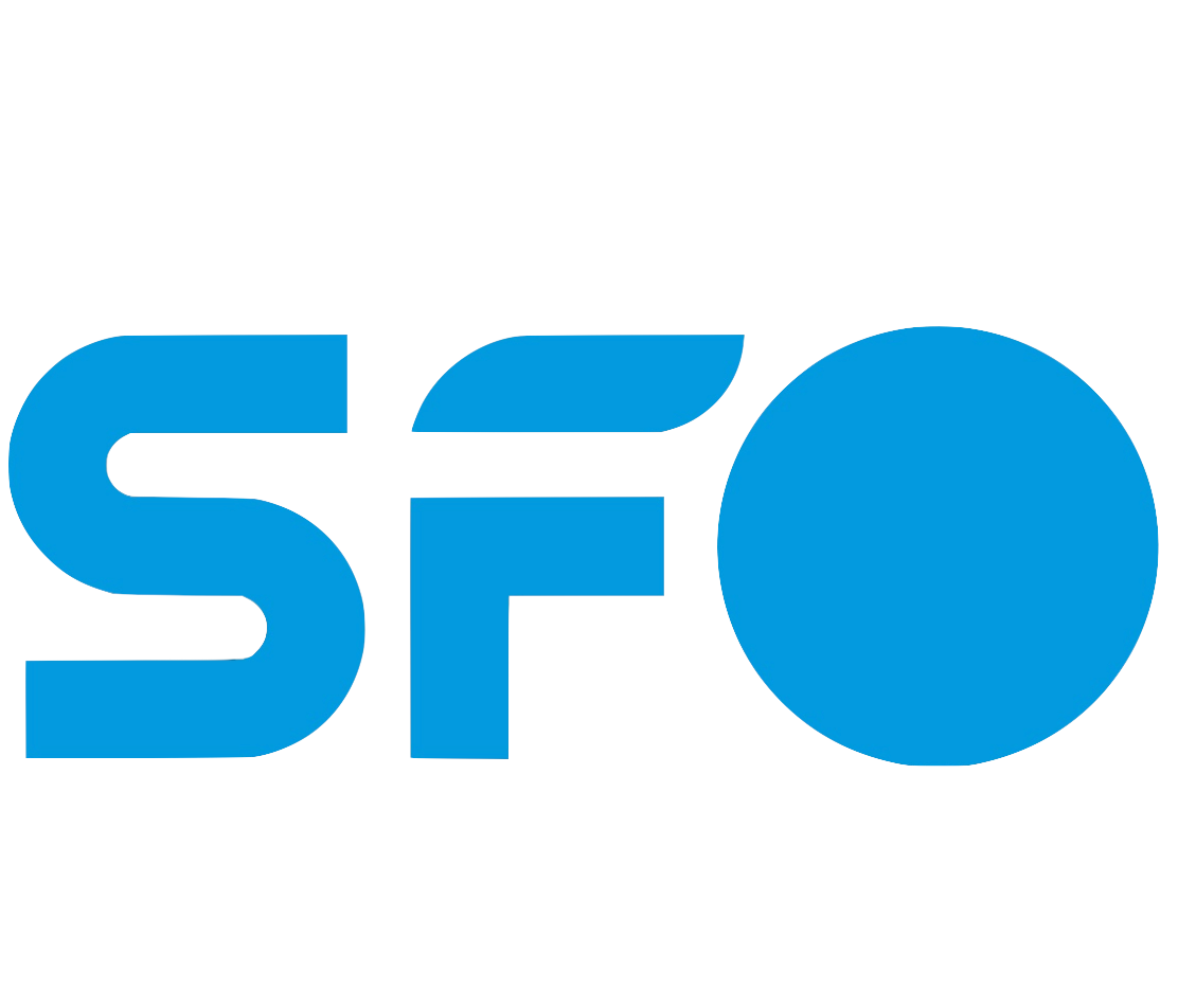 San Francisco International Airport After more than two decades, the airport has announced a change in its brand. The airport unveiled a new logo, saying goodbye to the previous design known as the “airline” logo.
The change, which includes bold, light blue lettering, is reportedly intended to represent the airport’s history while being brighter and more vibrant than the previous look. Although the logo was unveiled earlier this week, the airport says it will take “several years” to replace the previous design.
New & Modern
SFO announced on Wednesday that its new brand of “continued commitment to modernization and exceptional passenger experience.” The last time the company introduced a new logo was 24 years ago.
Photo: San Francisco International Airport
Ivar C. Satero, the airport director, spoke about the new design.
“We are excited to introduce our new brand and logo, which reflect the exciting changes at SFO. Just as our old logo marked a time in the early 21st century, the new logo demonstrates our commitment to delivering an airport experience that puts people and our planet first.”
A new vision
The airport says the new look is the result of extensive research in collaboration with local designers over 18 months. Last year, SFO launched a five-year plan focused on sustainability and the passenger experience.
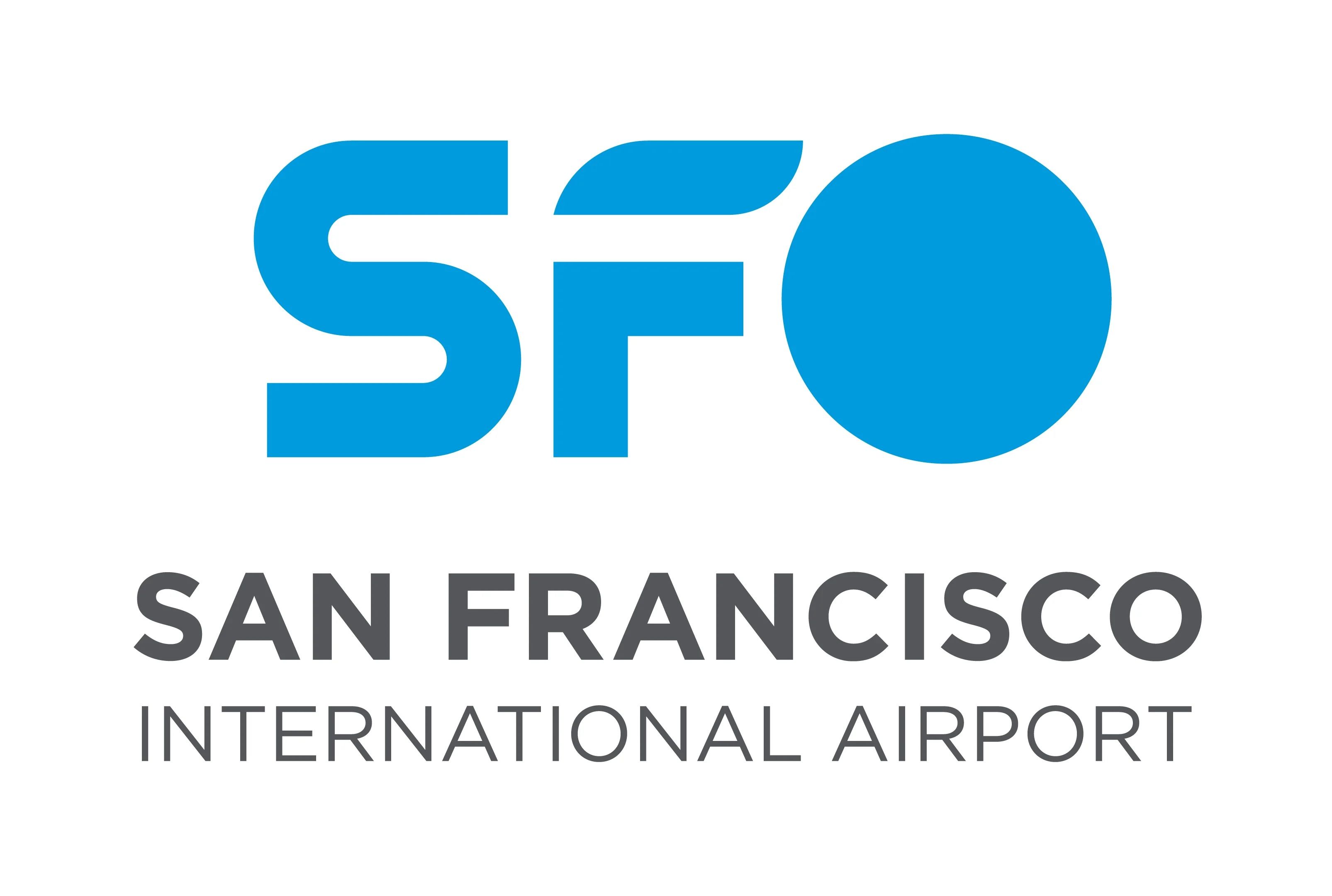

The light blue base color is called “SFO Golden Hour Blue” and is a homage to the past.
“From the flowing path of the S to the wing of the F to the portal of the O, the new SFO logo represents the spirit of our rich history, the dynamism of the present and the limitless possibilities of the future,” the airport said. “The logo also reflects our new vision: To inspire the extraordinary; and our new mission: To deliver an airport experience that puts people and our planet first.”
Listen
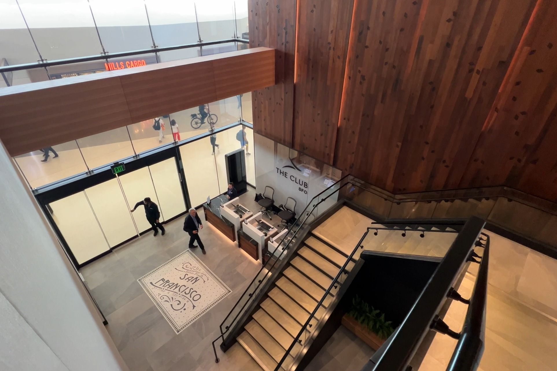
Take a look: Club SFO officially opens at San Francisco International Airport
It is the newest space in the club’s global network of airport lounges.
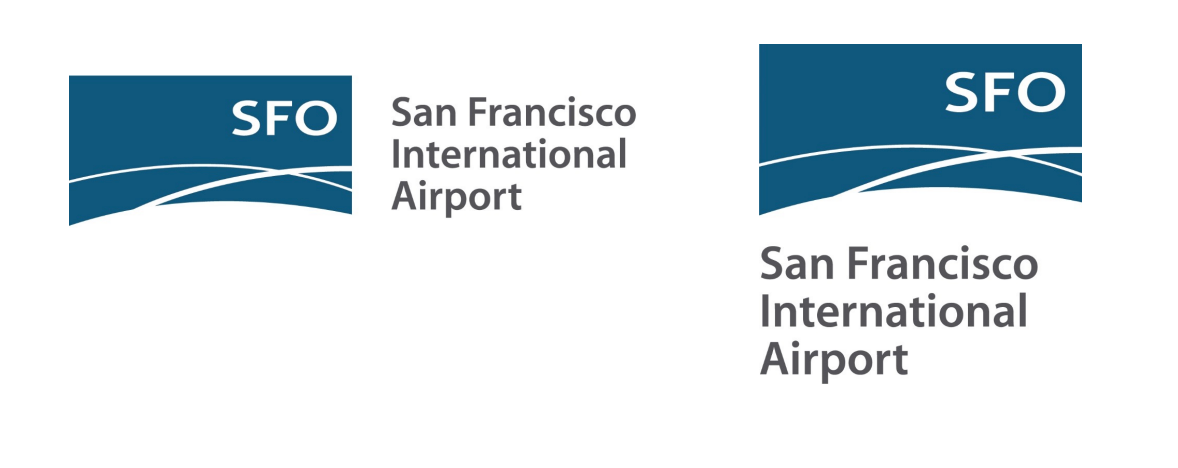
The previous and familiar logo was introduced on November 29, 1999, to signal the airport’s reinvention for the 2000s. It featured a primarily dark turquoise square background with a curved base. Two white lines crossed near the bottom right corner – hence the name “Airlines” – and the letters “SFO” were seen just above in bold white. The logo’s introduction also marked the airport’s first official branding guidelines, which included full use of the mark, a color palette, and instructions for uniforms.
SFO has revised the design several times over the years. Although it has not changed completely, the airport has added subtle elements to create a more modern look and increase its flexibility. In 2008, the airport’s title was added and placed both vertically and horizontally next to the airlines’ logo. According to the airport, the change allowed “more seamless integration on printed materials and especially on electronic screens.”
Photo: San Francisco International Airport
Further updates were made in 2013, which featured a gradient option, but this was retired after just four years. In 2017, SFO made the final update to the airline’s logo, returning it to the flat look.
Introducing the new look
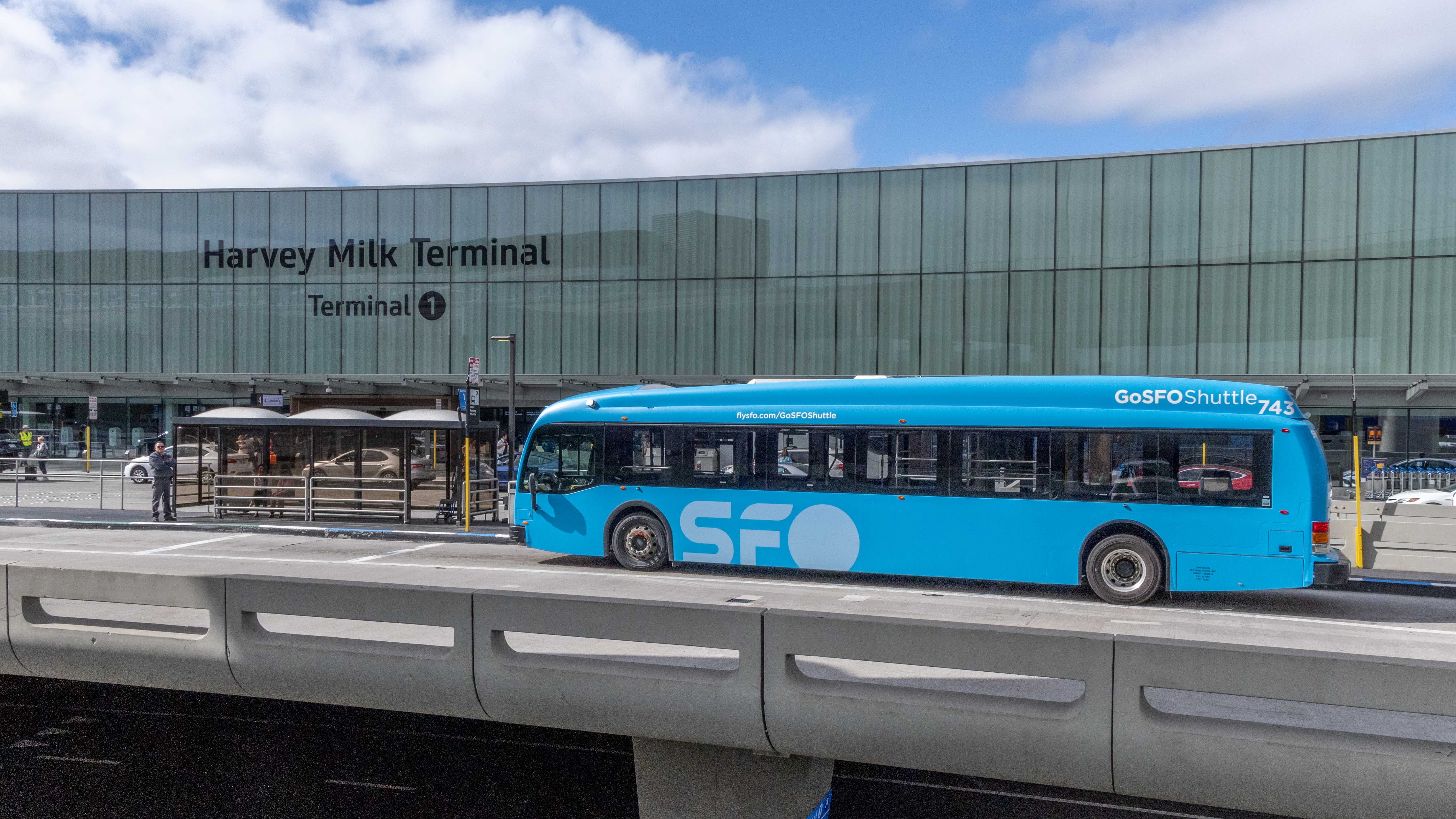
It will be several years before the new logo is seen on a larger scale. SFO said it will first phase out the old logo on digital platforms, while new and replacement elements such as uniforms, buses and printed messages will follow. The new design will be rolled out last on major construction and capital projects.
“At its core, SFO is about people: travelers, the community and the airport’s employees,” the airport explained. “The new logo offers flexibility in creating themed logos using the ‘O’ to reflect the essence of the people and projects that make us who we are.”
Read more
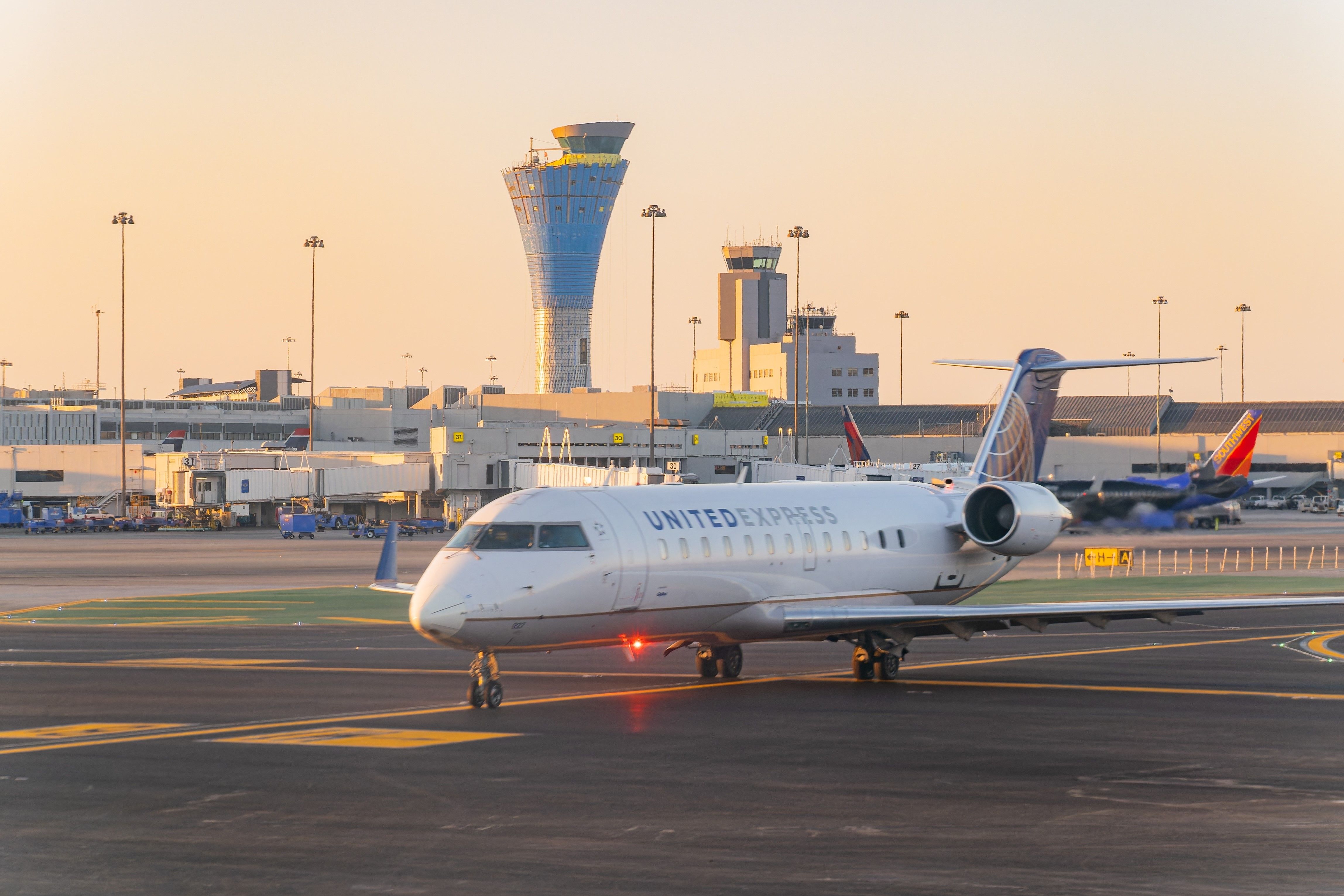
Relief: San Francisco International Airport expects early opening of main runway
The airport will soon resume parallel runway operations.

